Week 11:
- Jack Ferrari
- Nov 29, 2025
- 4 min read

House De-Keeping?
Finally the time has come to make some big changes... My next steps were: Lighting alterations and Decals!
For starters decals and modularity breakup. When approaching this I referenced a video by Jonjo Hemmens, an incredible ex Falmouth student I had the pleasure of meeting last Expo Day for a portfolio review. In this stunning and informative breakdown of his recreation of Disco Elysiums "Tequila Sunset" Jonjo discusses a method of creating damage decals that was of particular interest to me.
Beyond Extent (2024). Recreating Disco Elysium in UE5 with Jonjo Hemmens. [online] YouTube. Available at: https://www.youtube.com/watch?v=eq5CFCFF-FY [Accessed 09 Dec. 2024]
This involved taking a ripped paper texture and layering it with what would be your exposed wall; overall combined with a grungy/ damage shaped opacity mask. Something mentioned in the video was how imperfect these could be; ultimately the size and nature of these decals mean any weird edges or small imperfections would not be noticed which is often something I do struggle with, wanting to ensure every element is pixel perfect.
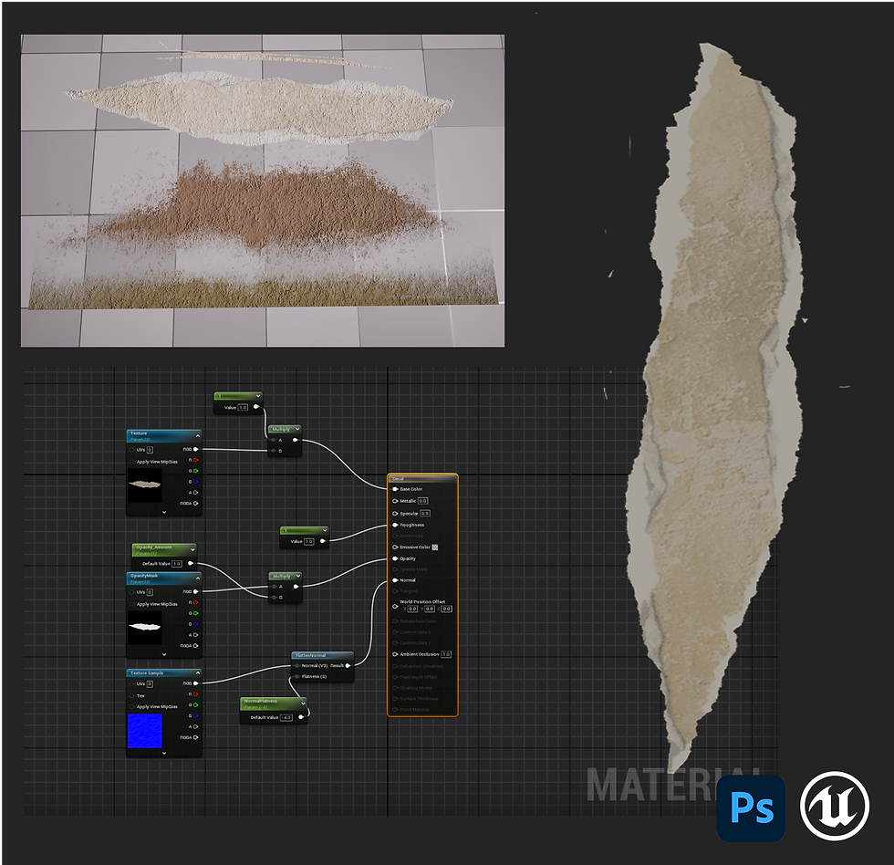
My recreation of the base damage decal was very similar to the demonstrated version but following the process did demonstrate how truly effective these can be so will absolutely be creating more in the future.
I also made some more grunge decals (as material instances using variant textures) again using a bumped version of my wall's normal map, this will help breakup the thresholds between geometry meeting ie: ceilings and walls whilst also acting as dirt/ dust on surfaces further enhancing the milage I get out of my already created content.
In tandem with sections of damaged peeling wallpaper really helped with creating a more weathered lived in appearance to the house. Something that is missing from the movie version but creates more character rich piece which is what I wanted from my scene.
Parallax Material
Under the guidance from William I sought to create a parallax material that would help push the details of my coving panels around the top of my room. (where previously I had overcompensated with grunge and AO) this would seek to push the detail using technology found in Unreal.

Whilst from the immediate side the effect can be disorientating, from the correct angle ie: from being below (where the player would be if this were a playable game level) It does really help push out those details and create a sense of depth that was certainly missing beforehand. To achieve this I followed a video on the Learning Space and setup the required nodes in Unreal.
Lighting Headaches
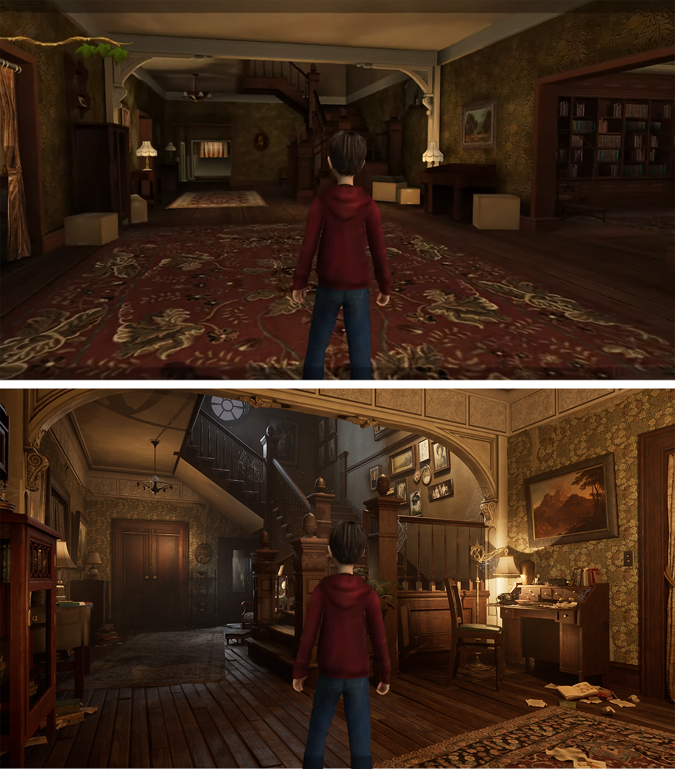
The lighting in my scene has been possibly the biggest battle I've continually lost thus far... Never quite reaching where I want it to.
Lacking the "perfect window" to provide light and other rooms does limit where I can create intrigue and interest from. The main scene from the movie is also lit in extremes with it all being very washed out by an obnoxious array of lights on, rivalling that of Blackpool or far too dark as lit purely from the sun. Where the movie can use light to pull your eye around is by having other side rooms flooding the corridor; I do not have the luxury of (as much as I wanted to create them going into this project).
The difficulty mainly sits in:
My focal point should be the desk, that is where my hero asset is and if it were a game level this is where you'd want the player to go first. Communicated by this being the area of highest contrast/ light.
The round window at the top cannot produce enough light to light the entire scene and in doing so becomes far too bright, creating a pinpoint focal point away from everything.
The physical desk being in a pokey corner away from where the traditional draw should be (down the corridor into the house/ up the stairs) presents another huge barrier as will always be fighting an uphill battle.
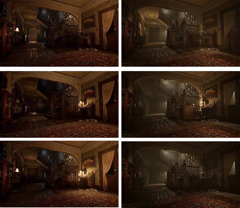
To reapproach this I replicated my scene and overhauled all of the lights in a frantic throwing content at the wall and comparing afterwards.
Comprehensive Thoughts
The introduction of a cool light/ transition into a night time scene really helps push the contrast of the piece overall balancing out where the viewers attention travels. The new blue gradually draws your eye upwards into the middle of the scene helping really push the warm light created by the desk. Also pushing the previously obnoxiously bright window backwards.
Having variants with the back door open draws your attention further into the room. If this were a finished house with all elements completed and going back there was the destination it succeeds. However the goal is to attract the player to the desk, not out of the corridor so ultimately for this project isn't as appropriate.
The more foggy silent hill esque versions I personally prefer. They have a real stale and emotive feeling that is lacking in all the others. You can really feel the air and creates a more spooky vibe that is interesting and personally improves the whole balance (almost going too far the other way where nothing is interesting anymore). When consulting Tom he also thought these were a stronger approach and set the scene apart from others like it.
The downside to this however was it succeeds because the focus is not on the desk anymore, I purposefully strayed away from drawing your eye to that single corner and utilised the fact you are in a corridor with depth, not awkwardly stumbling to the first piece of furniture tucked in a corner.
In finality I had a big choice, go a more traditional route with a temperature contrasted lit night-time scene or try something more interesting and go atmospheric and spooky. The answer was ultimately I wanted to show off my modelling and everything I had created so going for a more lit scene was the route I decided (ultimately echoed by Williams perspective also choosing the brighter lit versions)
I will still explore the more unique approach in the future as does have the makings of something more engaging but feel I need more rooms to help sufficiently sell the space and atmosphere.


Comments