Closing Thoughts
- Jack Ferrari
- Nov 29, 2025
- 4 min read

FINAL POST
For my final post on this project I wanted to look back at my process and do a general overview of what I felt were my successes and shortcomings across these past 3 months.
Successes:
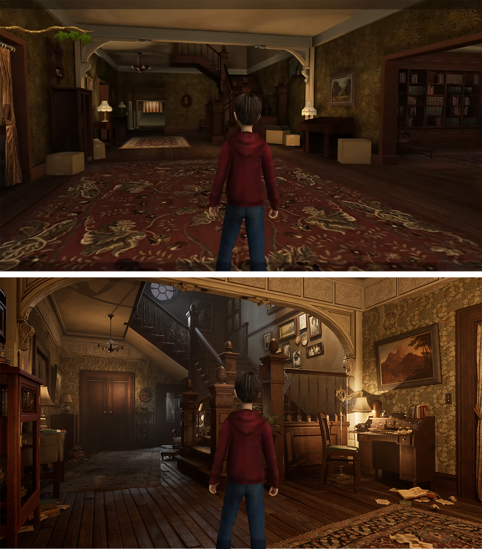
Observation: I do feel I did a respectable job at translating the key elements and composition of the main inspiration scene. With elements like the archway and staircase being a pretty damn close recreation. These were also the most efficient videogame appropriate workflow elements, using trim sheets combined with a more unique sculpted section from ZBrush; most evident with the newel post. Culminating in a modular and I feel well observed couple of sections.
Program Usage: I explored a good amount of new systems and workflows for this project. Most notably Marvelous Designer this is undoubtedly going to be used far more in my future projects, deciding this is the definitive route for any fabric/material based asset I may need to create. And using Houdini Resolve was a big revelation, an intuitive video editing program that is easy to pickup and use is an immensely valuable revelation I can also use on future projects.
Scene Quality: Overall the quality of things in my scene is pretty consistent with very few looking noticeably out of place. Whilst this has resulted in a high base polycount in certain areas my FPS was consistently above 50 often even 60 and if this were a game project I could make more obvious improvements to overall efficiency but as more of a portfolio piece I did feel it was an appropriate trade off.
Organization: On the whole I followed industry naming conventions and folders (M_ for Materials, T_ for Textures etc) this did really help keep my project moving in a manageable way and really assisted with general efficiency. Especially when it comes to having so many assets and involved parts.
Overall vibes: The scene has a nice feeling to it, one such area I am particularly pleased with is the desk. Whilst there are obviously some improvements to be made this small area where I truly let all of my knowledge collate: form hero assets, decals, clutter, image to material, Zbrush and entire Adobe suite usage does make it look pretty damn nice.
Shortcomings:
Lighting: The lighting in my scene was something I was never quite content with and is almost certainly something I will readdress in the future under some more guidance. I do think my final setup is acceptable and improvement over others but does have many of my previous issues with focus being spread across the whole scene opposed to the desk which was achieved more efficiently in my older setups that did have more interesting contrast and value structures. However you can see all the details put into my assets which does make it effective in that regard.
Efficiency: I do have probably too many uniquely textured objects and could've gotten more mileage out of existing texture sets for example. Where poly counts are becoming an issue of the past it is now texture efficiency that the gaming industry is focusing on. However many of my furniture pieces are crafted from already textured variant pieces. Eg: the table uses the textured top of the glass cabinet and I did use material instances with parameters for many of the similar objects like paintings/ lamps/ vases and wood furniture.
Hero Asset: These are of decent quality and do show my understanding of the high poly low poly baking process but I probably didn't focus enough on them instead spreading my attention across more of the scene as a whole opposed to small props. With the book being probably a poor choice of main asset as doesn't particularly demonstrate that many skills. Although the modelling on my phone in particular was a result I was really content with, striking I feel a good balance of efficiency with quality.
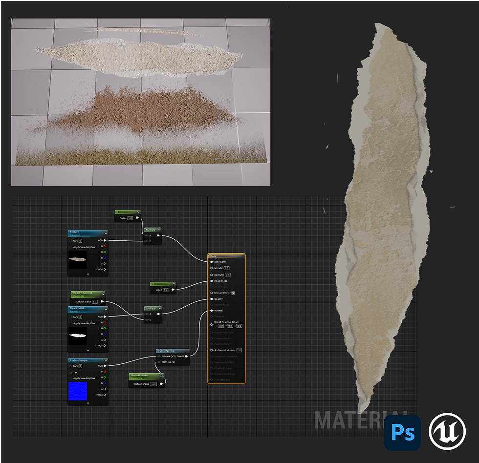
Wood: As I have been very vocal about almost certainly to the point of insanity I never expected such a prevalent material in real life to be so tricky to replicate digitally. Whilst I did create some personal Smart Materials in Painter that produced a result that improved from my first initial attempts it still doesn't quite have the read I wanted. Which is especially evident on the floorboards and desk, these certainly could've done with more attention and variants but did have to draw the line somewhere.
Overall from blockout to final result I do feel I've done an admirable job at recreating the hallway from 2008's The Spiderwick Chronicles and hope I have done Brent Lambert (Set Designer on the film) a justice. And whilst the whole house that was built for the set has been demolished may it live on in a small way here.
The Spiderwick Chronicles (video game). 2008. Stormfront Studios, Sierra Entertainment.
As a small personal note it is interesting to see how far game technology has come. The film had a tie in game released at the same time and whilst a small obscure movie tie in actually functioning game is by no means a fair or representative comparison/ representation of the wider gaming landscape of the time visually it is great to see how far technology has come and how a single student studying at university can create something of this level of detail using modern programs, engines and methods.
I would also love to give a big thanks to everyone who has helped by giving feedback, support and guidance through this entire project all of your words of wisdom and input has been truly invaluable. With special thanks to William, Tom, Iz and Jen it certainly wouldn't have been possible or nearly as enjoyable without you all. (Also my apologies for writing so much waffle... again... I doubt you expected anything different)


Comments