Week 2.5 Blockouts
- Jack Ferrari
- Feb 1, 2024
- 3 min read

Updated: May 10, 2024
THE THIRD STEP
Starting this week off I wanted to create a selection of bockouts prior to my taught workshop. This is often how level designers would work in an industry pipeline so following the tried and tested method I did just that. Traditionally you would start off in a 2D software but I have found I brainstorm most efficiently when in a 3D space where visualisation can be quick and reactive.
Starting my blockout with the standard 600x600 allocated plot size. A simple cube would become the basis for every one of these models, initially cloning and scaling in place to create a modular fascia board/ break that could be moved as needed, something that was to be especially important from my reference images. I also utilised the ScaleMan provided to ensure my building heights were realistic/ believable.
For all of the windows the extrude, offset and bevel tools were heavily utilised keeping geometry low and extremely simple at this stage. The slightly more complex forms of the gable were achieved using an inverse bevel to create a signature retractive curve.
Already considering modularity and efficiency I treated each floor as its own section that could be swapped and move around to see what configuration was most effective. This swap and change workflow could be helpful in a studio environment when pitching ideas and concepts with the ability to change them quickly. Something particularly prevalent in No.5, using the lowest floor and protruding section of the middle floor of No.3, among other elements.
Initial Blockouts: Modelled and rendered in MAYA:

My next stage was to render some simple shots of the buildings and take them into photoshop, drawing over the key elements and adding some simplistic details and personality. All the while referring back to elements of my moodboards and incorporating relevant aspects (blockwork, tiles, decals)
Drawovers: Simple concepting in Photoshop:
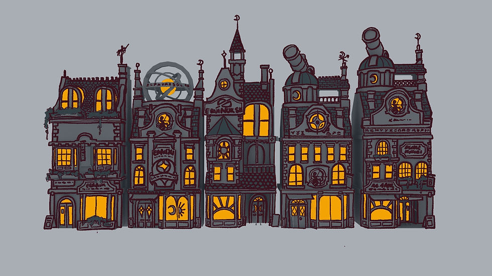
No.1: I felt to be the most traditionally quirky, classic shop with relatively little fantastical elements. The plant boxes do help breakup the block work/ silhouette but not enough to stop it from being overall boring.
No.2: I believe to be the most whimsical unique design with strange shapes fitting of the Wizarding world with its large tellurion/ orrery structure on the roof providing an interesting focal point and clear communicator of purpose. I do however question how effective this would be given the ground up perspective present from the narrow streets of Diagon Alley.
No.3: A more traditionally “fantasy wizard” approach in style complete with a spire and pointed roof extension. This is slightly more reminiscent of Hogwarts so possibly not fitting of the given location. The sun decal of the bay window however could nicely frame a selection of items, almost giving them an enticing glow.
No.4: Taking inspiration from the 19th century observatories I found, this has a tower and telescope. Overall feeling the most like a Victorian terraced building with its uniformity, adorned with a carved centaur plaque/sign in the centre. The 2nd floor is however too short as the two levels of windows are individually not the correct height to facilitate a normal person, let alone a centaur.
No.5: Is an amalgamation of several parts, hitting a balance of Victorian to fantastical. However it is slightly unbalanced/ noisy, leaning towards being top heavy, which from a distance would be interesting but as it’s a shop where most interaction is done at ground level, design work has been spent on aspects that are relatively inconsequential. This could be balanced out by levels of detail around the whole building.
Required Life Drawing Session
In this weeks Life Drawing Session we explored potential idea for our Concept Art's splash-art project. Understanding composition, value and environmental story telling is immensely important regardless of discipline and specialism.

KEY INFORMATION from the week:
Considering modularity even at this stage will help improve projects pipeline's efficiency.
600x600 is a tight space, utilising this effectively is going to be interesting.
Collecting Feedback will be helpful when it comes to deciding on a final concept.


Comments